Latest Stories
Documentation
Components overview
Components are reusable, context-free layout shells designed to be "fulfilled" with any context the user defines, as long as the parameters are pre-set when the component is created. They enable you to build modular, scalable, and consistent content structures for your site.
A component has two primary parts:
- Parameters: The variable context that can be customized when the component is used.
- Template: The layout or style shell that receives the parameters and renders the final output.
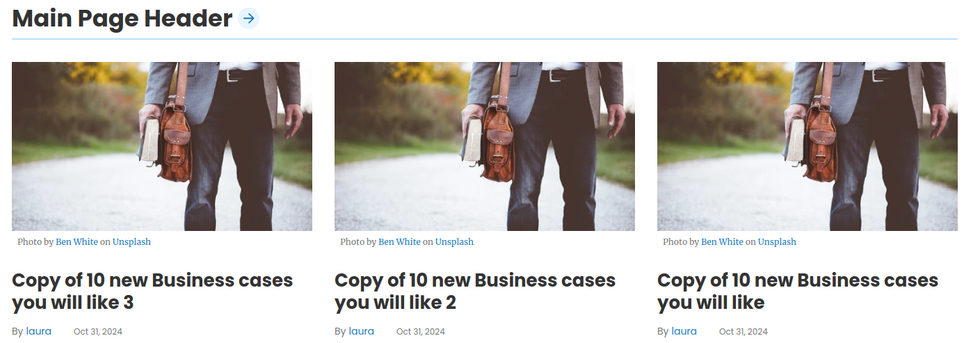
In practice, this allows you to reuse pieces of design while changing some of their content, maintaining the overall look and feel. For example, consider a block of content containing a Heading and three Cards. You can reuse this block in different positions or pages on your site. To achieve this, the design elements (like the Heading and Cards) are defined in the Component Template, while the actual Heading text and the source of the articles the Cards pull from are included as parameters. This means you can use the same component multiple times, each instance referring to different content on your website.
This approach is powerful because if you decide to update the style, add new fields, or make any other design changes, you only need to modify the Component Template once. Both instances will automatically reflect these updates, preventing code duplication and keeping your code reusable and clean.
How it works?
When you start creating a new Component, you’ll define the two main pieces:
- Component Parameters
These are the customizable settings for each Component. Parameters make the Component flexible, allowing you to adjust anything you'd like without modifying the template itself. Examples might include text, links, CSS classes, post data sources, post counts (which we call attribute sets), and more.
- Component Template
These are the actual elements—such as posts, images, texts, HTML, CSS, JS, and Jinja—that define the Component’s layout and style. The template uses the parameters defined above, integrating them to make each Component instance unique yet standardized. You can use these parameters as variables simply by placing them between {{ }}. They can be added to element fields, within the code, or in any part of the element you choose.
Example:
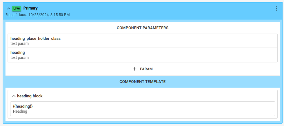
In this example you can see that the parameters are built for a configurable ad-block module:

It allows you to customize two parameters (a class and a heading text). That can then be used within the component template.

To be used as a class and heading text, in the cases above.
Using a component:
Once you've set up a Component, you can easily add it anywhere on your site. Just navigate to the desired page and insert the Component directly onto the page.
Click on Add Element

Click on Component
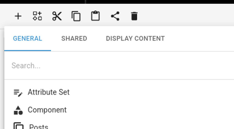
Choose which component you want inserted:

In the example below, we added this Component (componentAdDiv) to the Homepage.

On the right side, you’ll see where we define the values for the Component’s parameters.
For this specific case, we assigned main-heading as a CSS class and set the text to "This is the main heading."
And that's what you will see on the frontend:

Code View

Why is this so powerful:
This new feature provides developers with a single source of truth, eliminating the need to repeat code. With customizable Components, they can create reusable modules that can be used anywhere on the site, with any value they choose. This approach not only speeds up the process of creating new pages but also makes editing existing designs faster and more efficient.
Advanced features - Components Nesting
One of the standout features of this new architecture is its support for Component Nesting. This allows you to stack multiple components within one another, creating flexible and dynamic layouts.
For example, imagine a Call-to-Action (CTA) that includes a button (itself a Component) and a text element (also a Component). You can group both into a new CTA Component, ensuring a smooth content flow from top to bottom. This nesting capability enables developers to build complex modules by combining simpler, reusable components.
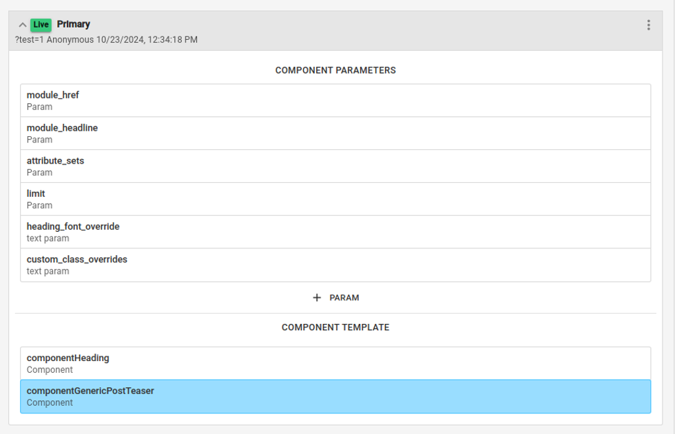
The Component below, called Three Components in a Row, is composed of a Heading Component and a Standard Post Component. This setup allows you to quickly structure sections with a heading followed by a standard post layout, all within a single reusable Component.
Advanced features - Attribute Sets
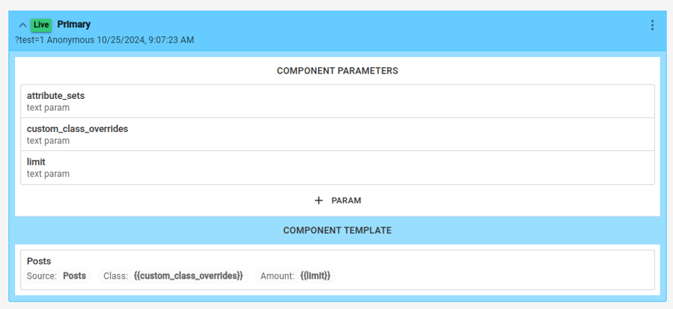
This feature simplifies post sourcing by grouping most of the post information you’ll need—such as order, source, type, and more—into a single field. With Attribute Sets, you no longer have to manage a lengthy list of attributes to pull in post data, making the process faster and more streamlined.
In the Post Component below, you can configure it with three main parameters:
- attribute_sets: Defines the grouped post information, like order, source, and type.
- css class: Applies a specific CSS class for styling.
- limit: Sets a cap on the number of posts displayed.

Once you’ve set up the parameters, you can integrate them within the Component Template:
Add {{ css_class }} to Custom Container Class to apply the specific styling class.
In the Code area, you can apply parameters like limit and attribute_sets directly to control the content displayed by the Component. Currently, these settings are configured within the Code area, but soon they’ll be available in the General section of
the UI, simplifying access without needing to navigate to Code.

When using Components that include Attribute Sets, you can define the specific values for each parameter, customizing how the content will be sourced and displayed.
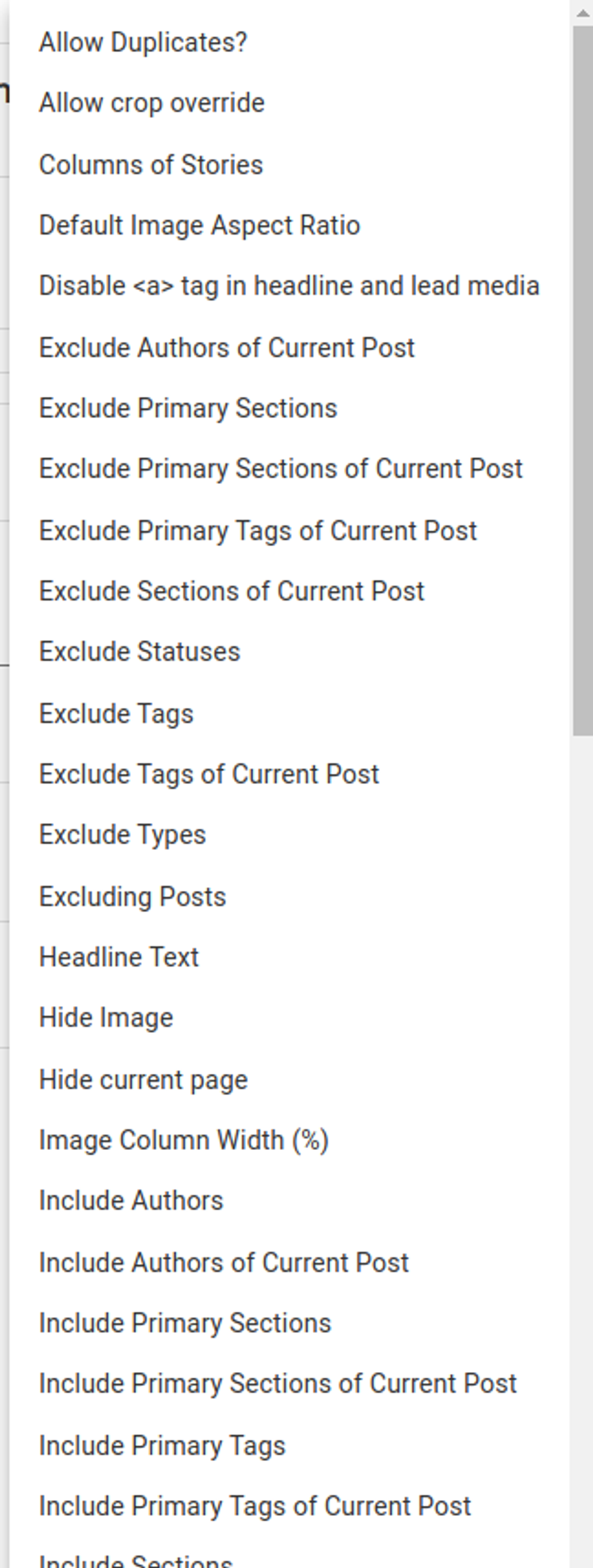
The incredible part of this feature is that you can setup as many attributes as you'd like, like you'd do in the post element:
Advanced features - Attribute sets Conditional
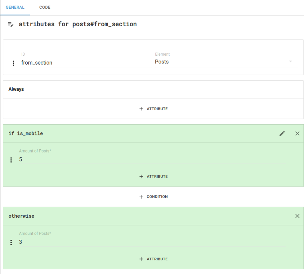
In many cases, conditionals are used to display the same Component with different source information. To simplify this, we’ve built these conditionals directly into Attribute Sets. This allows you to set conditions based on various criteria—such as user profile type, device, specific page, and more—all within a single Component setup. No complex conditional logic outside of the Attribute Set is needed.
This streamlining reduces redundant setup and enables greater flexibility in displaying content variations.
In the example below, Attribute Sets allow you to display a different number of posts based on device size. For instance, you might show more posts on desktop and fewer on mobile for optimal layout and readability.
This setup can be customized for any condition—not just device size—making it a powerful tool for adapting content based on various criteria, all within a single Component configuration.
Table of Contents
- How it works?
- Example:
- Using a component:
- Click on Add Element
- Click on Component
- Choose which component you want inserted:
- In the example below, we added this Component (componentAdDiv) to the Homepage.
- And that's what you will see on the frontend:
- Code View
- Why is this so powerful:
- Advanced features - Components Nesting
- Advanced features - Attribute Sets
- Advanced features - Attribute sets Conditional
© 2025 RebelMouse. All rights reserved.
Comments Moderation Tools