We have created this guide as a comprehensive list of Entry Editor layout elements, complete with detailed information on each element and its usage
Entry Editor Element Wrapper
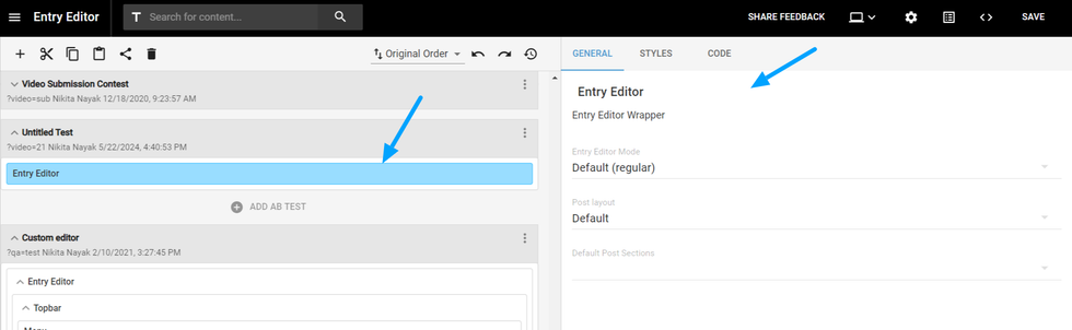
We have an Entry Editor Element wrapper that allows you to add various elements, styles, and custom code to enhance your editorial experience. This wrapper includes the following options:
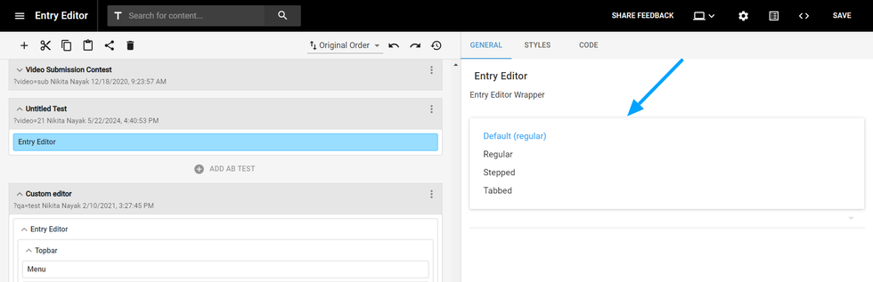
- Entry Editor Mode:
- Values: Default, Regular, Stepped, Tabbed
- Descriptions:
- Default and Regular: Display the Entry Editor view as seen when you click on 'Add Post.'
- Stepped: Presents a stepwise arrangement and input method.
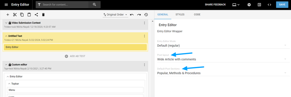
- Post Layout: This dropdown contains a list of all active post layouts. If you want articles created by the custom Entry Editor to be published with a specific post layout, you can select it here.
- Default Post Sections: Choose the sections where the post will be placed by default when creating an article using this custom Entry Editor. It displays the entire list of sections, and you can select multiple sections if needed.
Row/Column
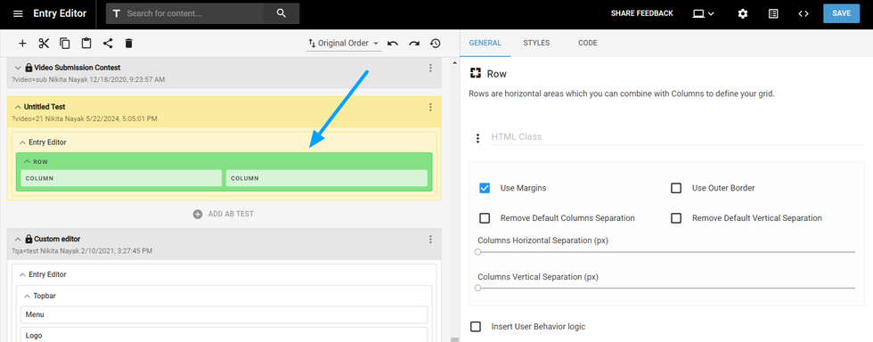
Rows and columns function similarly to those used in other layouts. They are primarily used for organizing multiple elements on a page
Custom HTML
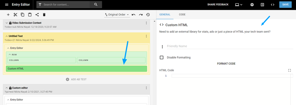
If you want to add custom HTML, including any custom code or scripts, to the Entry Editor, you can do so using the Custom HTML element.
Element Wrapper
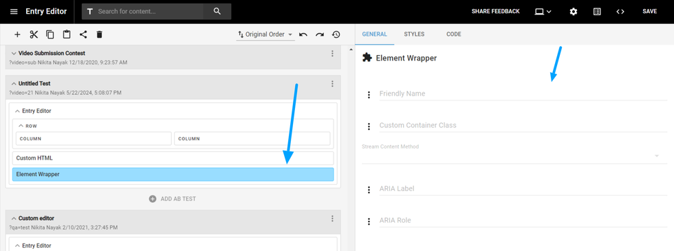
This element can gather other different elements together to achieve a desired design, avoiding any errors while formatting.
Confirm Dialog
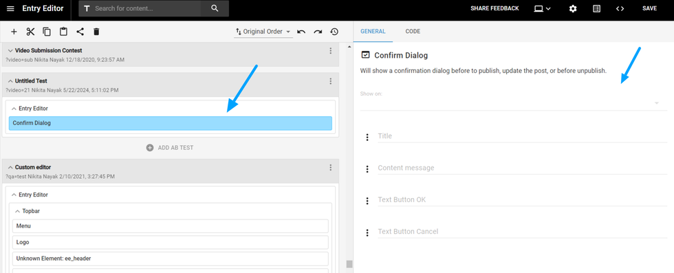
It will show a pop-up before publishing, updating, or unpublishing the post. You can edit the placeholders, message, and button text for this dialog box.
Leading media
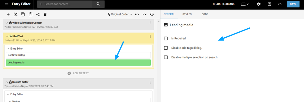
The Lead Media element is used to add the main image to an article. It has three settings:
- Required Checkbox: If checked, this setting makes the lead media image mandatory. If an image is not added, a validation popup will appear.
- Disable Add Tags Dialog: When an image is added, a popup displaying default tags appears. Checking this option will skip the popup.
- Disable Multiple Selection on Search: If you do not want editors to select multiple images while adding lead media, check this option. It will restrict the upload to a single image at a time for lead media.
Headline
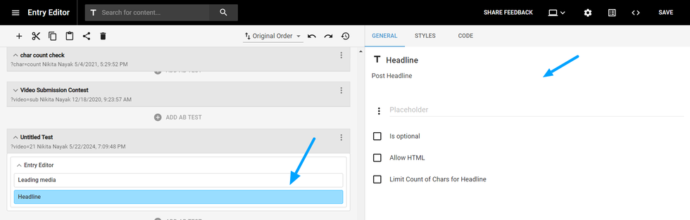
The Headline element is used to add the main title of the article. You can add a placeholder to this field and mark it as optional. If you check 'Allow HTML,' it will enable formatting options for the headline. You can also set a maximum character count for the headline.
Subheadline
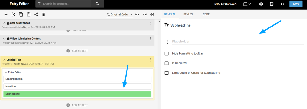
Similar to the Headline, but as a supportive summary text for your post. It can also be customized as a required field, adding a placeholder text, and can have a character limit set on it.
Authors
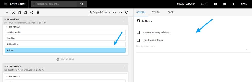
This element will display the author of the text in the post. You can disable the fields “Add Author” and “Add Community”, so the author will be only the person who created the post, and no additional authors will be added manually.
If you choose to keep the fields enabled, you can add a filter, so the authors shown while manually adding will only correspond to the group selected, e.g. “Guest Editor” group.
Body
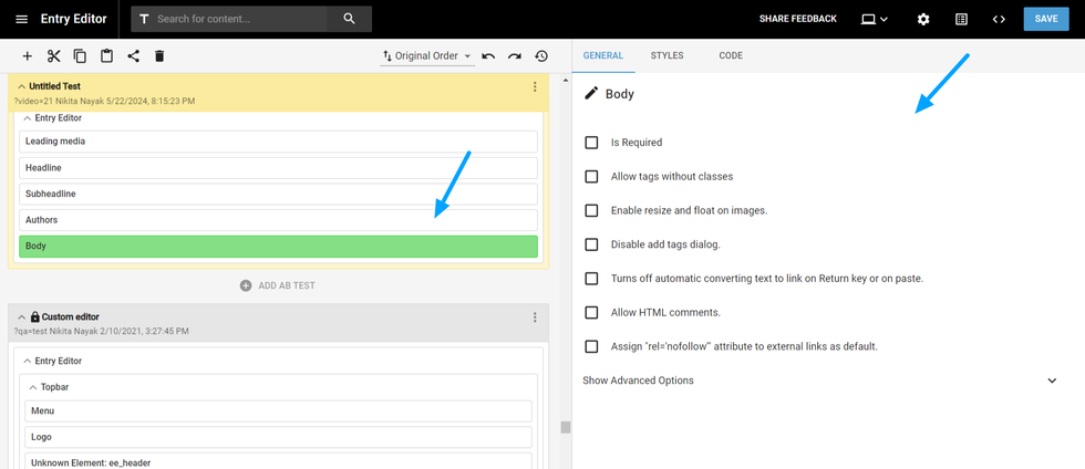
The Body element is where the post text is written. There are many additions you can make to this element:
- Is required: Mark it to make it mandatory to have a body text in your post;
- Enable resize and float on images: this enables you to customize the images within your post body text, resizing it or floating the image between the text.
- Turns off automatic converting text to link on Return key or paste: mark this if you don’t want to paste phrases copied with links directly on your text.
- Allow HTML comments: Mark this to disable comments in the HTML code part of the text
Right Rail
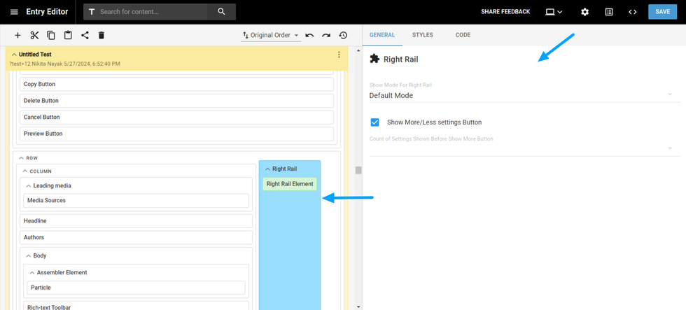
You can utilize this element to add Right Rail tabs. You also have the option to include expand/collapse functionality for the right rail.
Topbar
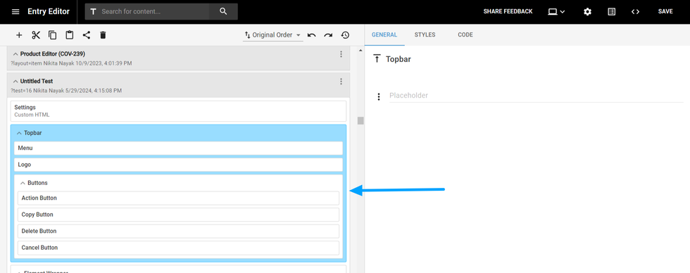
The Top Bar serves as your fixed compass — a way for visitors to navigate their way around your site and be introduced to your brand. Therefore it's best to keep it simple. A prominent logo, clean section links, share buttons, and a search bar are typically all you need at the top.
Button Settings
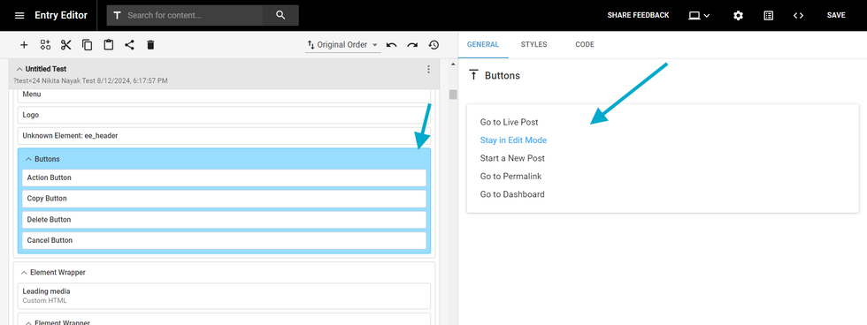
- Go to Live Post: When you click the publish/update button, it redirects you to the live post. This is the default setting.
- Stay in Edit Mode: When you click the publish/update button, it keeps you in the Entry Editor, allowing you to continue editing.
- Start a New Post: After clicking the publish/update button, it opens a new post for the author to continue creating another article.
- Go to Permalink: When the publish/update button is clicked, it redirects you to the permalink of the post.
- Go to Dashboard: Clicking the publish/update button redirects you to the Post Dashboard.
Post Custom Field
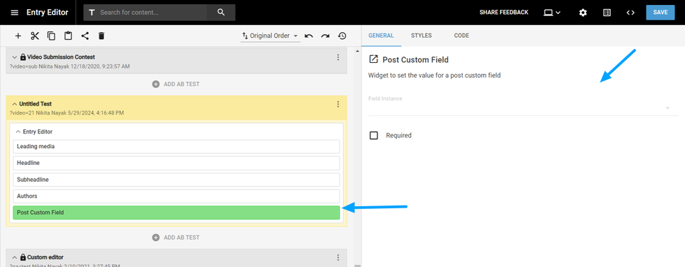
This widget allows you to set a custom field to be added to your post. You can choose among a vast variety of options in the dropdown.
Product Details
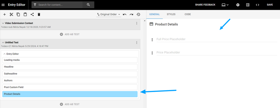
To create an e-commerce module, you can add the Product Details widget and place some placeholders for both the Full Price and the current Price for the product.
Pay with Stripe Button
This element adds a stripe button for users to finish their transactions. For this, you need to add:
- Button Caption: The text that will be displayed on the button
- Stripe Public Key: This key is provided by Stripe when you have an account with them
- Amount: The price of the purchase
- Company Name: The name of your enterprise
- Reditect to: You can choose to redirect to a URL or to another step created previously
- Redirect URL: The URL that will be redirected
UI text
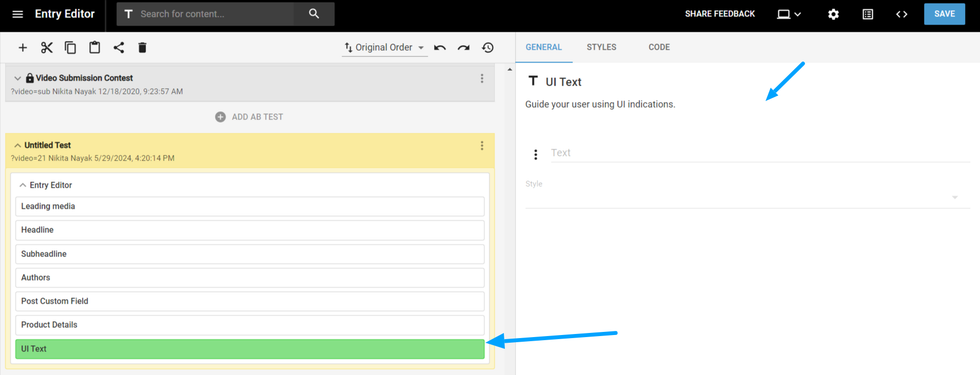
It is a text element to guide your user using some UI indications while in Entry Editor.
Post creation date, Embargo date, Unpublished datetime
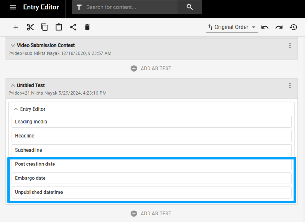
Each of those elements adjusts the way your post is published or not.
The Post creation date shows the date when the post was created.
The Embargo Date will “block” the publication of the post until the date chosen. It is similar to a Scheduled Publishing, but you cannot publish before the chosen date.
The Unpublished Datetime will show the date when the post was unpublished. A post can be manually unpublished or scheduled to be unpublished.
Post sections
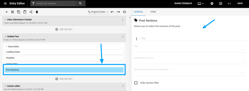
The Post sections element will allow you to select and attribute a section to your post, among all the sections created in your CMS.
Post status
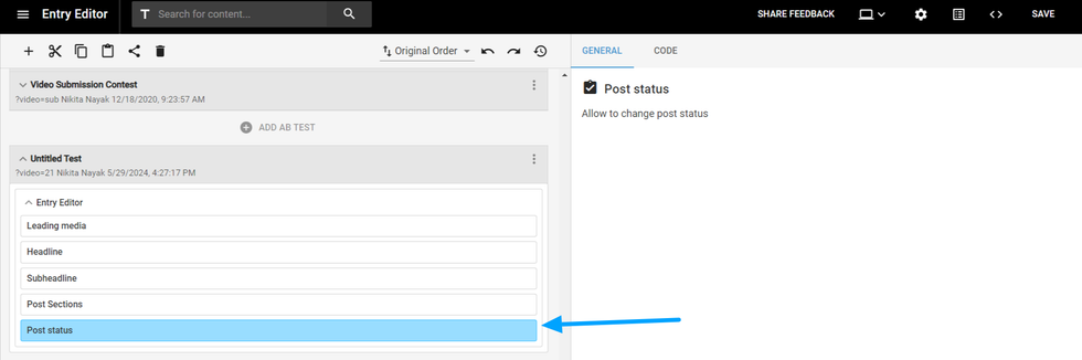
This element adds a dropdown to change the status of the post from publish to draft and vice versa.
Private comments
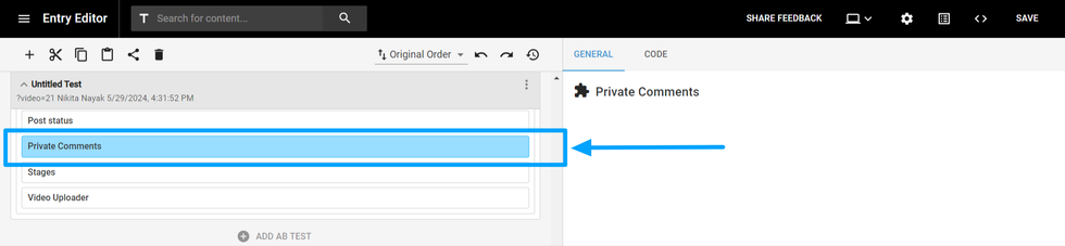
You can enable the Private Comments element in Layout & Design Tool to show internal team comments in Entry Editor.
Stages
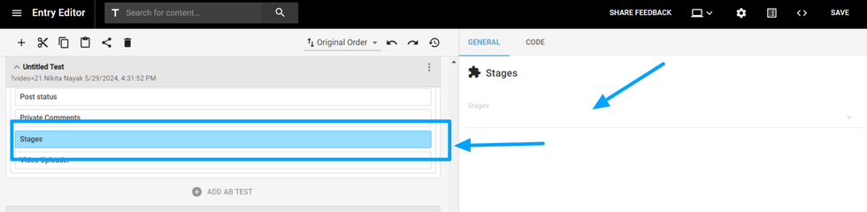
You can use this element to add a Stages drop-down menu anywhere in Entry Editor:
Video uploader
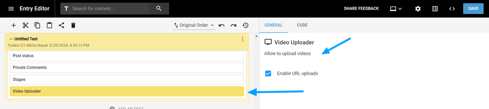
Using this element you can add Video Uploader anywhere in your Entry Editor.
Source URL
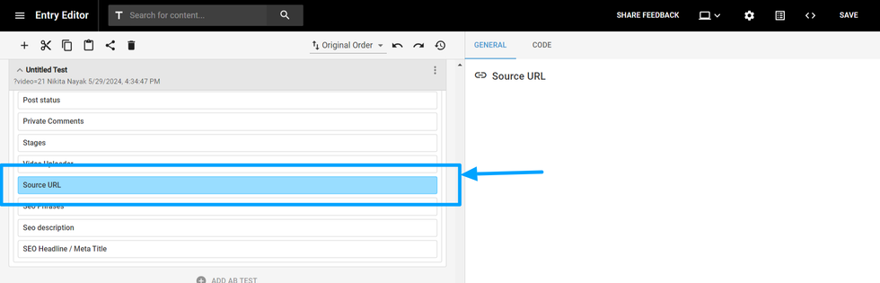
This adds a field to include the source URL.
SEO phrases
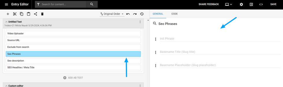
This element is used to add or edit the URL slug. You can change the placeholders and the title of this field.
SEO headline/ Meta Title
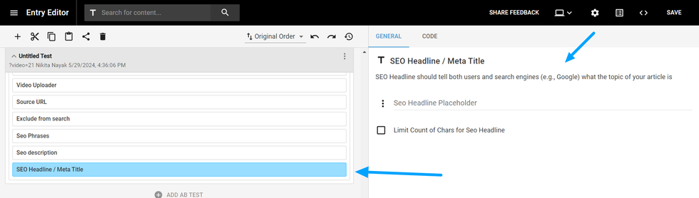
This element adds a text field for entering a headline specifically for SEO purposes. You can set a placeholder and limit the character count.
Social headline
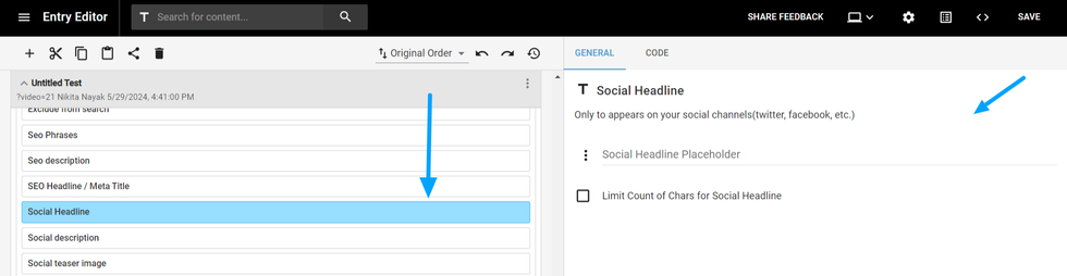
This element adds a text field for entering a headline specifically for Social media. You can set a placeholder and limit the character count.
Social description
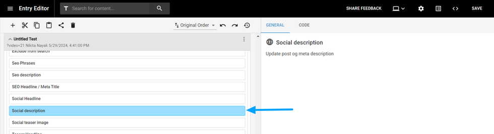
This element adds an Social description field to add details while sharing to social media.
Social teaser image
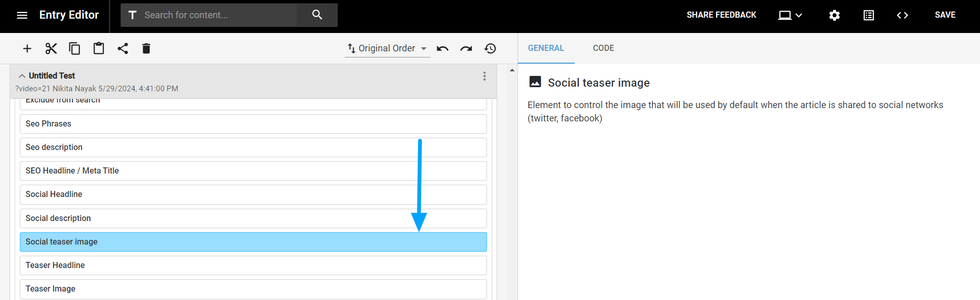
This element allows you to add an image for sharing on social media.
Teaser headline
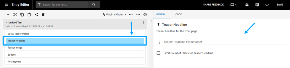
This element adds a text field for entering a Front Page headline. You can set a placeholder and limit the character count.
Teaser image
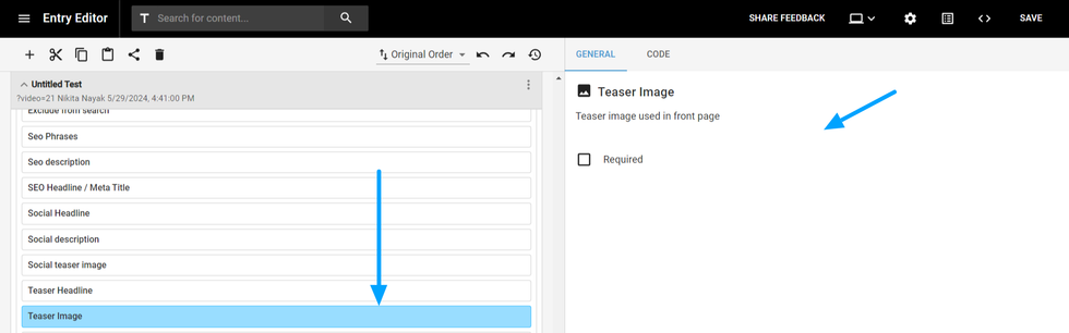
This element allows you to add an image that shows up on Frontpages.
Sidebar search
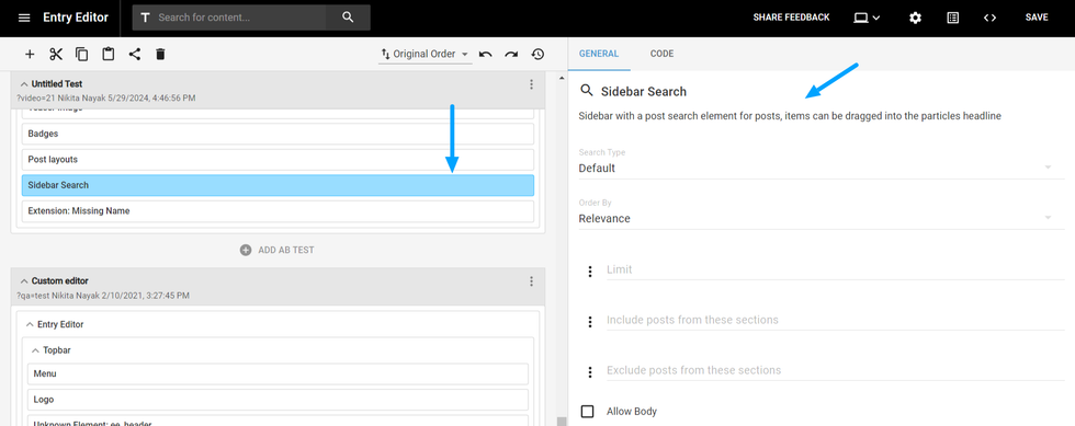
Sidebar with a post search element for posts and define the sections of your post.
Extension
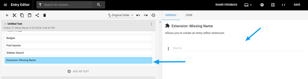
This element will group different extension items, called “Extension Item”.
This Extension Item element allows you to select some actions on a drop-down "Execute On" then it will return something like one of the options below:
- On post creation: It can be used to initialize data on post creation like default authors, tags, etc.
- After load: this is loaded after the “on post creation” and the editor UI is already loaded, it can be used to modify some UI interfaces.
- Before Save: is called every time the post is saved.
- Before Publish/Update: is called before making live the changes in the public site, there is not difference between publish and update.
- Before Schedule: here the post is still draft *but* will be published automatically so the most probable is if you need to do something before publishing, you should apply here too.
- Before Unpublish: will be triggered after a published post changes back to draft.
Post layouts
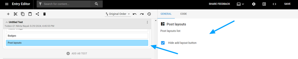
This element displays the available post layouts for your article. You can also choose to hide or display the 'Create New Layout' button.
Badges
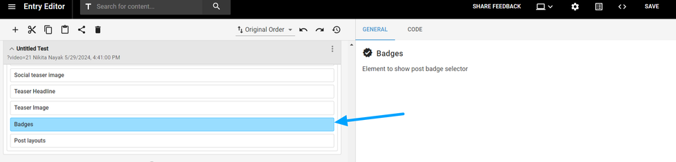
This element will add an option that will allows you to add a badge to your article from a list of available badges.
Preview
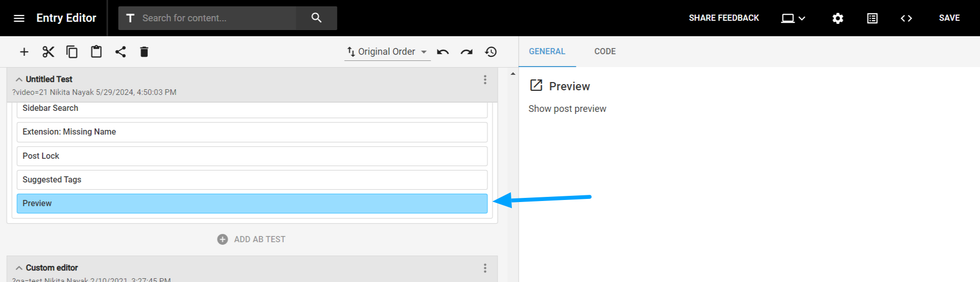
This element displays a preview of the article in Entry Editor.
Optimizer Box
Optimizer Box element is used for a custom AI feature.
Post lock
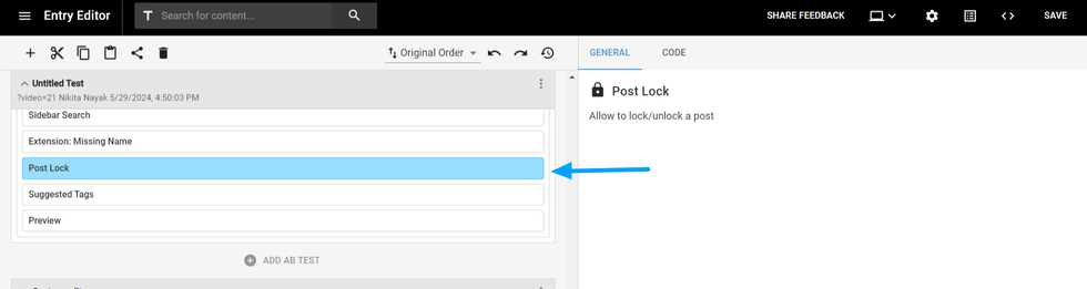
This element will add a checkbox to lock the post.
Suggested tags
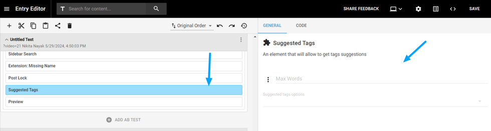
This element displays tags including options such as SEO tags, Previously Used Tags, and AI-generated tags. You can also limit the number of tags generated by AI and select which options you want to update.
Table of Contents
- Entry Editor Element Wrapper
- Row/Column
- Custom HTML
- Element Wrapper
- Confirm Dialog
- Leading media
- Headline
- Subheadline
- Authors
- Body
- Right Rail
- Topbar
- Button Settings
- Post Custom Field
- Product Details
- Pay with Stripe Button
- UI text
- Post creation date, Embargo date, Unpublished datetime
- Post sections
- Post status
- Private comments
- Stages
- Video uploader
- Source URL
- Exclude from search
- SEO phrases
- SEO description
- SEO headline/ Meta Title
- Social headline
- Social description
- Social teaser image
- Teaser headline
- Teaser image
- Sidebar search
- Extension
- Post layouts
- Badges
- Preview
- Optimizer Box
- Post lock
- Suggested tags


© 2025 RebelMouse. All rights reserved.
Comments Moderation Tools